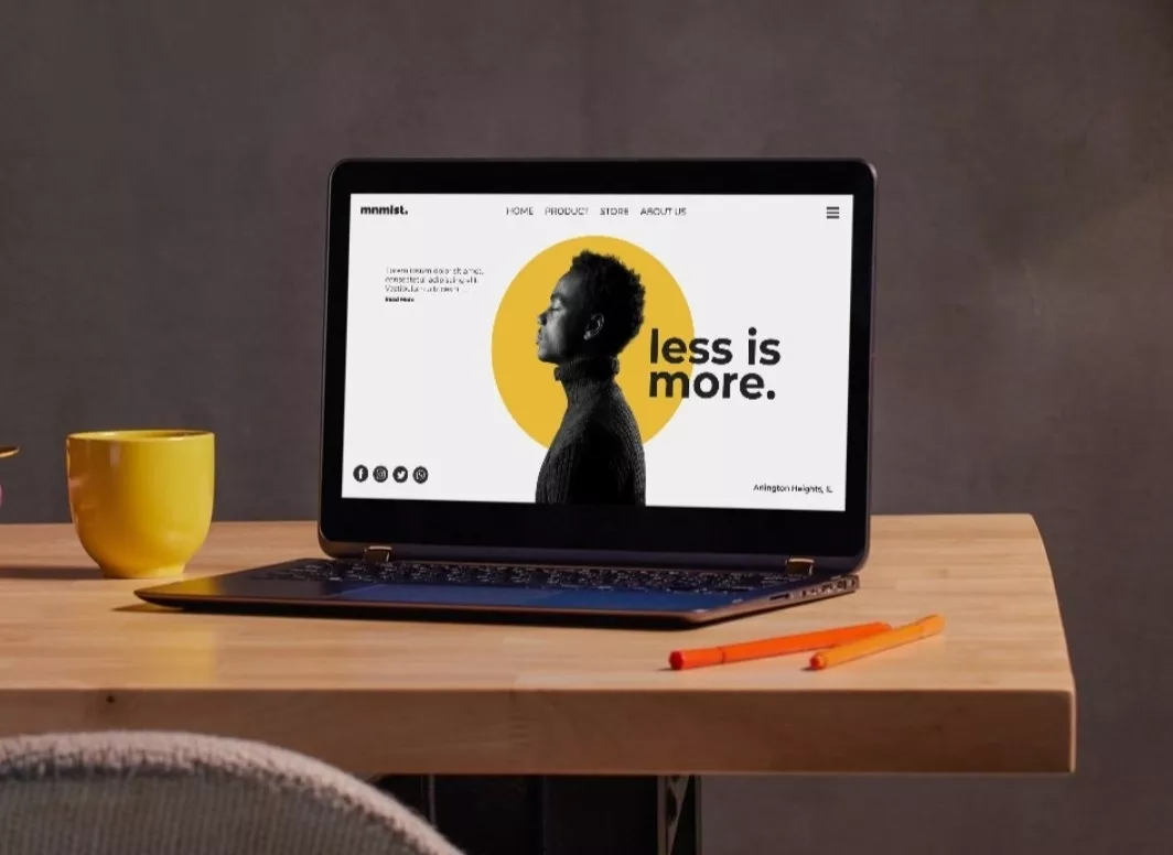
Simple websites aren’t boring — they’re smart. They make your visitors feel at ease, help them find what they need, and often perform better than flashy, complicated sites. You might think adding more buttons, animations, or banners makes your website more impressive, but in reality, it can overwhelm your audience. Visitors come to your website for answers, not distractions.
In this article, we’ll break down why simplicity works so well and how it can help your website succeed in the EU and UK markets.
1. Cognitive Load and User Attention
Your brain prefers less
When you land on a website, your brain immediately starts filtering everything on the page. It decides where to focus and which elements to ignore. The more clutter you have, the more your brain works. You feel tired even before you know it.
Simple websites reduce cognitive load. You don’t need to explain every detail; you just guide attention in the right direction. Clear headlines, visible calls-to-action, and logical layouts help users understand your site without thinking too hard.
Think of it like walking into a clean, well-organized store. You instantly know where to go and what to look at. That feeling translates online. Visitors feel calm and confident. They’re more likely to explore, scroll, and interact.
Choice overload kills decisions
Too many options can freeze users. When your page has multiple banners, links, or buttons, users don’t know where to click first. They pause, get frustrated, and leave.
Simple websites limit choices intentionally. They focus on one main action per page, guiding users step by step. For instance, a homepage may highlight your services clearly with one primary button for “Get a Quote” or “View Portfolio.”
You want to make decisions easier for visitors, not harder. By keeping choices clear and purposeful, you improve engagement and increase the chances that users will complete desired actions.
Clarity builds confidence
Visitors trust websites they understand. A clean layout immediately answers three key questions:
- Where am I?
- What does this site offer?
- What should I do next?
When those answers are obvious, users stay longer. They scroll, click, and interact. Search engines also notice this behaviour — lower bounce rates and longer sessions signal quality.
Your website doesn’t need to show everything at once. Highlight what matters most. You’ll be surprised how a clear, simple approach outperforms complexity in both user satisfaction and performance.
2. Fewer Choices, Clearer Actions
Every click is a decision
Every button, link, or call-to-action asks something of your visitor. Too many of them dilute the power of each one. When nothing feels important, nothing gets clicked.
Simple websites prioritise actions and guide visitors naturally. You don’t need to shout at your audience with flashing banners or multiple pop-ups. A focused approach ensures users know what to do next.
Clear paths feel professional
Websites that provide a single, clear path per page feel intentional. Visitors subconsciously notice the design choices, navigation flow, and hierarchy. When actions are obvious, users feel guided, not pressured.
For EU and UK audiences, clarity and professionalism are particularly valued. Users expect websites that respect their time. A simple, focused site signals trustworthiness and competence, which encourages enquiries, sign-ups, and conversions.
Navigation should disappear
Good navigation works without drawing attention. Simple websites reduce menu items and group content logically. Visitors find what they need faster.
Smooth navigation builds trust and creates a positive impression. You want users to move seamlessly from one section to another, feeling like the site anticipates their needs.
Remember: every unnecessary menu item or link is a distraction. Keep it minimal, logical, and functional.
Simple content drives action
With fewer distractions, your messaging stands out. Headlines, buttons, and visuals get noticed. Your visitors can focus on your value proposition, rather than getting lost in clutter.
A simple website isn’t just about design; it’s about guiding users toward meaningful actions that benefit your business.
3. Simplicity vs Minimalism
Simple does not mean empty
Many people confuse simplicity with minimalism. Minimalism removes aggressively, while simplicity removes intentionally.
A simple website can be full of rich content, useful features, and helpful visuals, but nothing distracts from the user experience. Every element should have a purpose. You want visitors to engage with what matters, without overwhelming them.
Content still matters
Simple websites are content-focused. Every paragraph, image, or video earns its place. Visitors can easily read, understand, and remember information.
For EU and UK audiences, clear, well-structured content is especially important. Users expect websites that communicate efficiently and respect their time. Simple, readable content improves engagement and naturally boosts search engine rankings.
Design supports meaning
In a simple website, design serves content, not competes with it. Spacing allows the page to breathe. Typography guides reading flow. Colour highlights important actions without distracting.
Visitors sense harmony intuitively. The result is a website that feels polished, professional, and approachable.
Simplicity encourages interaction
When users aren’t distracted, they interact more. They scroll further, click buttons, and explore additional pages.
A simple, meaningful design encourages conversion without pressure. Visitors act naturally because the website makes it easy, enjoyable, and obvious what to do next.
4. When Complexity Becomes a Problem
Complexity grows quietly
Websites rarely become overly complex overnight. Features accumulate, old pages linger, and unnecessary design elements creep in.
Over time, users feel lost navigating through too many options, pop-ups, and menus. Even loyal visitors can get frustrated.
Simple websites require ongoing decisions about what content and features remain relevant. You remove distractions and maintain clarity.
Maintenance becomes harder
Complex websites take longer to update. Errors hide, updates fail, and performance drops quietly.
Simple websites are easier to maintain, scale, and adapt. They save time, money, and headaches. For businesses targeting EU and UK markets, ease of maintenance ensures websites remain professional and fast, meeting audience expectations.
Performance always suffers
More elements mean more files, scripts, and images. Slower load times frustrate visitors and negatively impact search rankings.
Simple websites load faster. They perform better on mobile and desktop. Speed keeps users engaged and satisfied, while improving SEO performance and organic visibility in search results.
Simplicity supports growth
A clean, well-organized website is easier to expand. Adding new features or content doesn’t disrupt the user experience.
By focusing on simplicity, you future-proof your website, ensuring it remains effective as your business grows. Visitors will return, engage, and convert more consistently.
And Last but Not Least
Simple websites respect visitors, their attention, and their time. They provide clarity, focus, and a smooth journey.
By reducing clutter, prioritizing actions, and designing intentionally, your website performs better, feels better, and builds trust with users.
Simplicity is not a design trend — it’s a strategy for long-term growth, usability, and satisfaction.


