You might think words do all the talking on a website, but in reality, most communication happens without a single sentence. Design elements like color, typography, layout, and rhythm silently guide your visitors, convey your brand’s personality, and influence decisions.
Understanding these non-verbal cues is key to creating websites that feel intuitive, trustworthy, and engaging. Let’s explore how your site speaks to visitors without relying on words.
1. Color as a Silent Messenger
Colors influence mood instantly
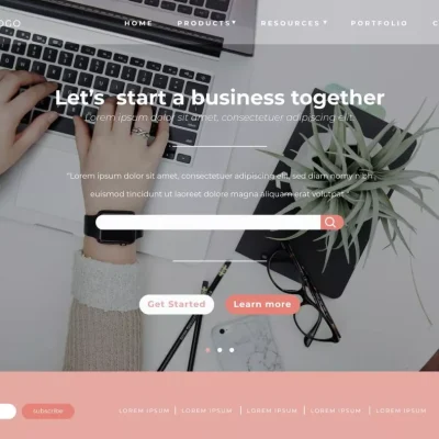
Colors convey feelings without you saying a word. When a visitor lands on a website, the hues you choose can make them feel calm, excited, or even hesitant. For example, blue evokes trust and stability, while red signals urgency or energy.
You might not notice it consciously, but your brain reacts immediately. That reaction can influence whether you stay on a page, click a button, or bounce. Choosing colors intentionally ensures visitors feel the way you want them to.
Color guides attention
Beyond mood, colors act as directional signals. Bright buttons, contrasting call-to-actions, or highlighted features tell users where to click. Without these visual cues, visitors may get lost or miss essential content.
For example, a muted background with a vibrant “Get a Quote” button draws attention naturally. You want your colors to lead, not distract, so users can navigate intuitively.
Cultural considerations in color
If your audience is in the EU or UK, color perception may vary slightly. While blue often signifies trust universally, other shades may have different connotations across regions. Knowing your audience ensures your silent messaging aligns with their expectations.
You can test colors subtly using A/B testing or heatmaps to see what works best for engagement. The right palette enhances user comfort and encourages interaction.
Color communicates mood, guides attention, and subtly influences behavior. Thoughtful color choices strengthen trust, highlight actions, and make websites more approachable.
2. Typography and Personality
Fonts convey tone
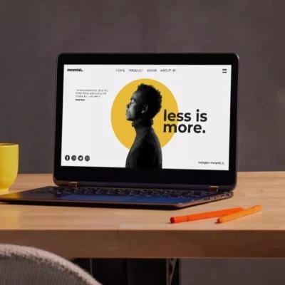
Typography does more than display text; it sets personality. Serif fonts feel traditional and reliable. Sans-serif fonts are clean and modern. Handwritten or decorative fonts feel personal or creative.
You instantly communicate brand character without a single word. Visitors interpret your typography subconsciously, forming opinions about professionalism, style, and tone.
Readability matters
Personality is great, but readability is essential. A fancy font that’s hard to read frustrates users. Short line lengths, proper spacing, and clear hierarchy improve comprehension and engagement.
Think about mobile users – small screens amplify readability challenges. Choosing fonts that scale well across devices ensures everyone gets the intended message.
Hierarchy guides interaction
Typography organizes content visually. Headings, subheadings, bold text, and spacing tell visitors what to focus on first. You naturally guide their eyes through the page, highlighting essential information without forcing it.
A visitor can scan a page in seconds and understand structure effortlessly. That’s non-verbal communication at work: your typography speaks before your words do.
Fonts convey tone, improve readability, and guide attention. Thoughtful typography communicates personality, professionalism, and hierarchy without saying a word.
3. Layout as Guidance
Structure matters
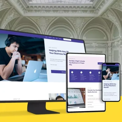
Layout arranges elements in a way that tells visitors where to look. Columns, grids, and spacing create visual paths. You want users to understand priority, focus areas, and relationships between sections.
A well-structured layout makes scanning effortless. Without clear alignment or visual hierarchy, users may feel lost, frustrated, or overwhelmed.
Directional cues
Images, buttons, and whitespace act as visual signposts. You can subtly direct attention to forms, products, or key content without text-heavy instructions.
For instance, placing a product image beside a call-to-action naturally encourages clicks. Your layout communicates what matters most through positioning and flow.
Balance and consistency
Consistency in layout creates familiarity. Visitors know where to find menus, buttons, and information across pages. Balance ensures no section overwhelms another, making the experience comfortable and intuitive.
A chaotic layout can make even great content feel confusing. Simple, consistent arrangements convey professionalism, reliability, and care.
Layout silently directs attention, clarifies structure, and creates harmony. By guiding users visually, your website communicates efficiently and intuitively.
4. Visual Rhythm and Flow
Movement and pacing
Visual rhythm refers to the way your eyes move across a page. Repeating patterns, spacing, and alignment create flow that feels natural. Visitors can scan, pause, and interact without conscious effort.
Flow ensures important content isn’t overlooked. When rhythm is off, users may skip sections or get frustrated trying to follow the page.
Whitespace as breathing room
Whitespace isn’t empty; it’s purposeful. It separates content, highlights elements, and improves readability. You allow visitors’ eyes to rest and absorb information effectively.
You want users to feel guided, not crowded. Proper spacing creates a calm, professional experience, especially for EU and UK audiences who appreciate clean, organized design.
Patterns encourage engagement
Repeating elements like icons, headings, and visuals establish a visual rhythm. Users anticipate patterns, which reduces cognitive effort and makes interacting with the site effortless.
You can subtly highlight calls-to-action or important features using rhythm. Visitors subconsciously follow cues, increasing the likelihood of clicks or conversions.
Visual rhythm and flow guide the eye, improve readability, and make scanning effortless. Proper pacing and spacing communicate clarity and professionalism.
Last but Not Least
Websites communicate without words through color, typography, layout, and rhythm. Each element silently shapes perception, builds trust, and guides user behavior.
By understanding and applying these non-verbal cues, you create websites that feel intuitive, engaging, and professional. Visitors don’t just read your content – they experience it.
A website that communicates without words stands out, performs better, and creates lasting impressions across the EU, the UK, and beyond.